Landing pages are the secret weapon that marketers use to generate high-quality leads and boost profits. However, creating landing pages isn’t an easy task. To get your customers to click and sign up, you need to get the page exactly right! This includes the colour, design, layout, headline, content, CTA and so much more. Many marketers lose out on generating leads as they get one or the other of the above aspects wrong. We know that designing a landing page keeping in mind all the above factors might seem like a daunting task. Hence, our experts have analysed hundreds of landing pages to find the best designs which drove results.
Slack
Source:Instapage
The above landing page by Slack, a business communication platform is at the top of our list. This is amongst the best landing pages as it gets several things right. The first thing that you will notice is the length of the landing page. Short and concise landing pages do not require any scrolling and are easy on the eyes, making them a favourite amongst customers. Secondly, the CTA button is compelling as it includes the word “free” which attracts people to click. Bright images, a single form field and social proof all work towards prompting the customer to fill-up the form.
Promo

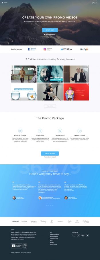
The second page on our list is the one above by Promo. The best thing about this page is the use of videos. Any marketer worth their salt knows that videos drive conversions, be it on your website, in emails or in landing pages. Promo, being a video creation company, adequately used videos in every part of their page to drive conversions. In addition to using compelling videos, they also used social proof in the form of testimonials to attract customers.
Hootsuite
This is amongst the best landing pages that we have come across. Most customers will not scroll till the end of your page. Understanding this, Hootsuite included all major elements above the fold. This includes a catchy headline, a compelling CTA with the word “free” and the major benefits. As a result, the design is eye-catching and attracts customers. The remaining portion of the page has additional benefits and features.
Microsoft

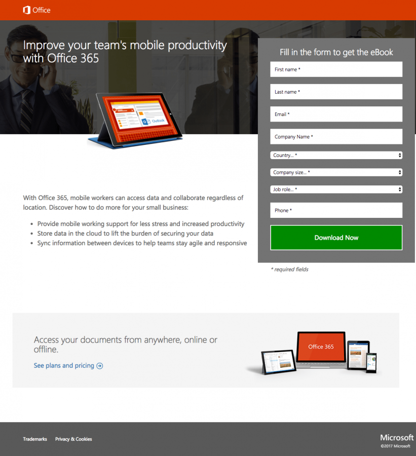
This landing page by Microsoft is informative and effective. The design is simple and does not distract the customer. The headline, instead of trying to be catchy, focuses on providing some benefit to the reader. Most customers do not have the time to read a lot of content. As such, Microsoft ensured that their page design used minimal content to communicate the required information. There is a product image and a green CTA button which attracts and drives conversions.
Landing pages are the most effective means of generating leads and prospects. Designing a landing page requires creativity and acumen. At Telloquent Solutions, our experts can help you design compelling landing pages that convert and boost your sales. Get in touch with us to know more.
